Maryland’s Dredged Material Management Program
The best way to describe the DMMP Program? Innovative and cool. Really cool.
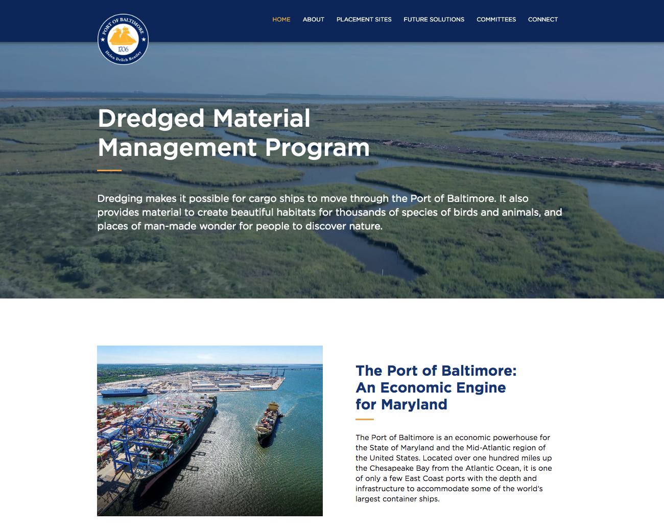
The background
The Maryland Port Administration (MPA) oversees Maryland’s Dredged Material Management Program (DMMP). The DMMP program is a long-term strategy for overseeing the disposal and beneficial use of sediments dredged from the Port of Baltimore.
How to manage and utilize all of that sediment in a way that is good for the Port, good for our communities, and good for the environment is what the State of Maryland Dredged Material Management Program (DMMP) is all about.
I worked with Council Fire to create a website that increases the public’s knowledge of the DMMP program.
Establishing the ideal user journey
To give users the best experience, we had to understand them first. Why do they come to the website? These and other foundational questions framed our approach to creating a strategic, user-centric web design that effectively communicates DMMP’s mission and vision.

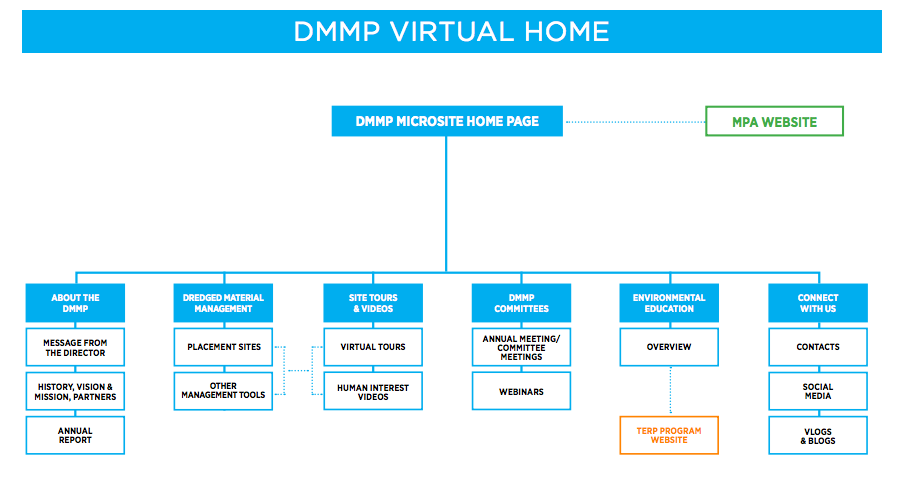
Simplicity Starts With a Sitemap
Effective sitemaps are necessary elements for every website, and the DMMP was no exception. We used this step of the process to position the building blocks of the site to create the most efficient and effective user experience possible.
Typography & Color
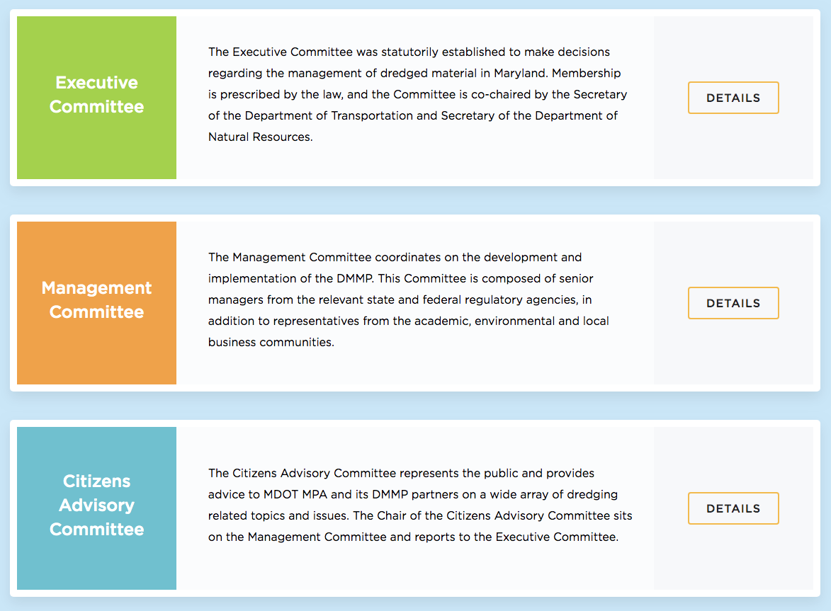
We wanted our typography and color choices to be readable and visually appealing.
Bright, bold, innovative, optimistic, professional are the five adjectives that were the foundation for our font and color selection.
Typography & Color
The challenge with this project was making sure we had a clear and well-documented process for migrating the content to a new CMS. We had to first perform a content inventory to get a feeling for how much content was available, where it was stored, and in what formats.
Once we were able to define the scope of the content migration we could decide what content should be kept and improved and what content needed to be retired. It also allowed us to decide what new content needed to be created from scratch to cover the gaps.
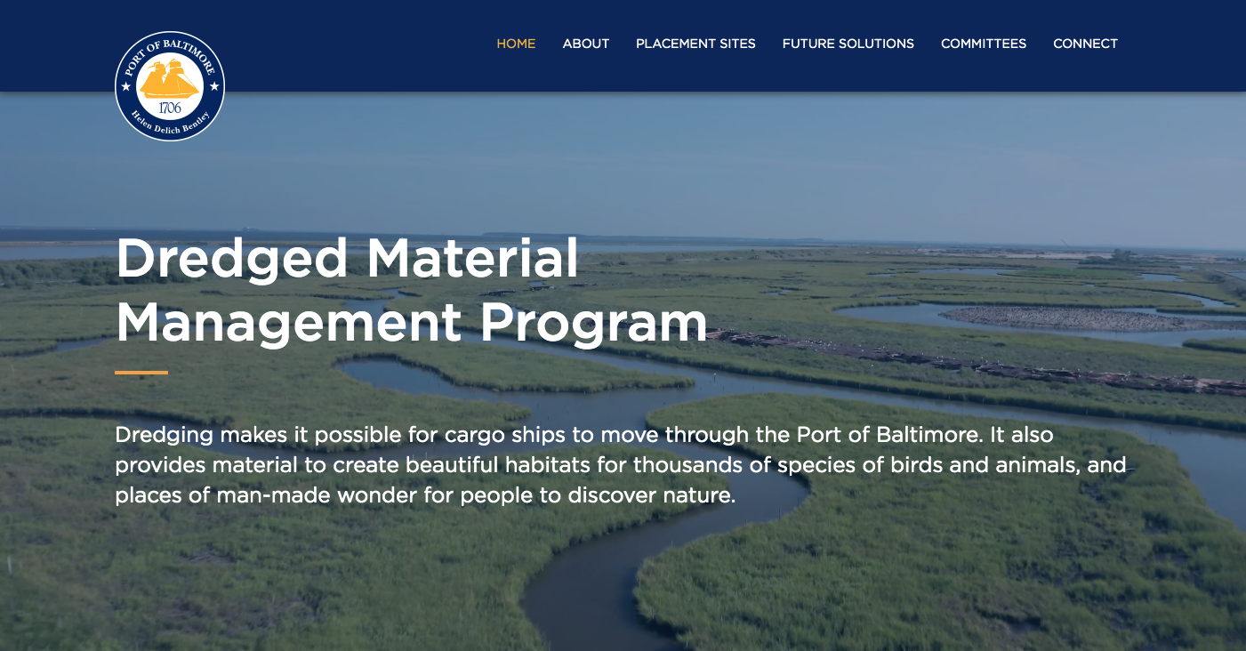
Visually stunning video hero banner
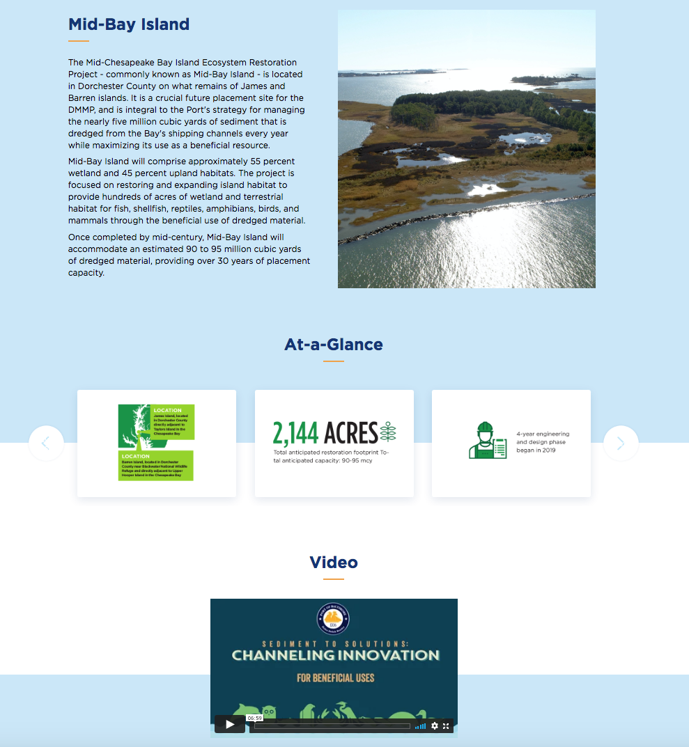
We used a prominent video showcasing one of the placement sites in the hero banner instead of a static image.
The video grabs the user's attention and draws them in as soon as they arrive on the site's home page. It doesn’t have any sound and relies only on visually impactful photography to support the text.
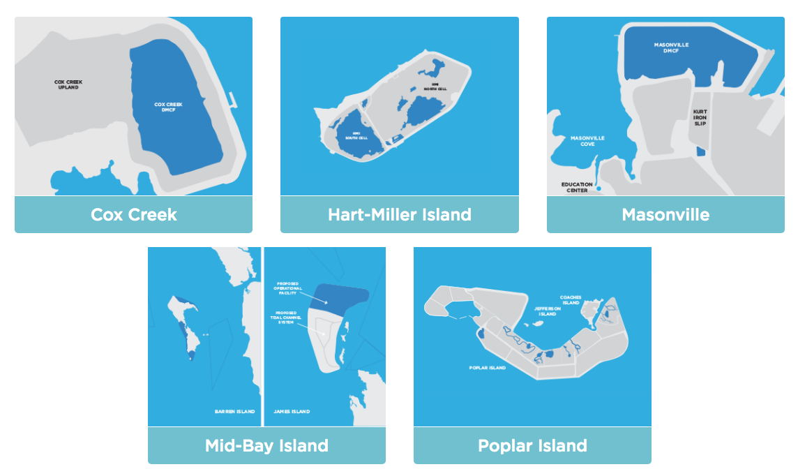
Custom illustrations
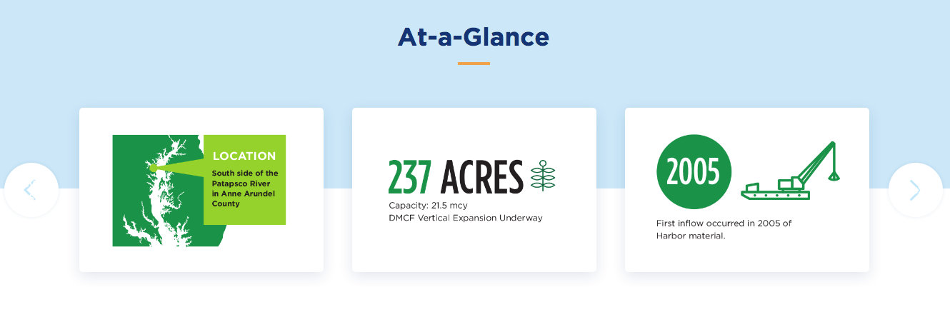
To draw attention to various sections of the website, we created unique illustrations that are used throughout the site.
On the Placement Site pages, these images are used to quickly communicate information and better explain the interesting facts about each of the placement sites.
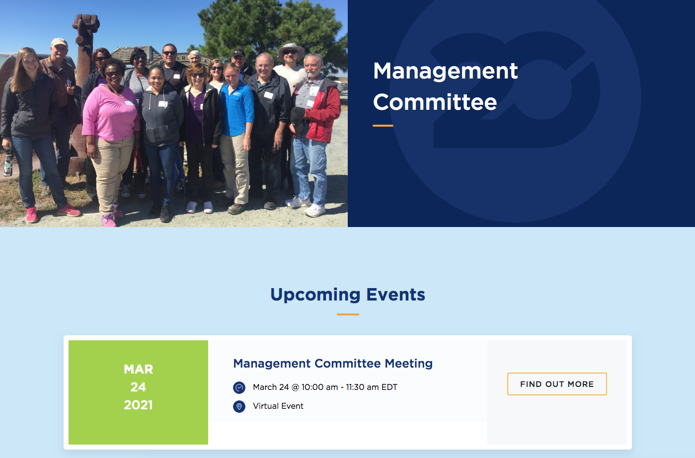
Dynamic Events
Event posts are pulled into various areas of the site dynamically to better engage users.
Easy to update = Owner friendly
Built on WordPress, the site is quick to load, seamless on mobile, and makes complex technology look effortless.
DMMP needed to be able to easily manage and update many components of the site. I developed flexible drag-and-drop modules and custom post types that are dynamically pulled into various pages. The client is able to make updates to the site without having to write a single line of code.

