Branding, Website & Content Strategy, SEO, Information Architecture, User Experience, Website Design, Custom WordPress Development
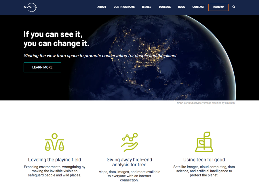
SkyTruth is a conservation technology nonprofit using satellite imagery and data to inspire people to protect the environment.
Their vision is to live in a world where everyone can see what is happening in the environment everywhere, inspiring action to protect our planet.
I was honored to have the opportunity to work closely with SkyTruth to design and develop a new website worthy of its powerful mission and vision.
The Challenge:
Despite this strong strategic focus, SkyTruth's previous website did not effectively showcase their impressive impact, depth of expertise, or global impact.
One of the biggest challenges with this website was that we were working with several different audiences that had very diverse information needs.
Another challenge was the quantity of content that SkyTruth had generated over the years. We had to decide what content needed to be migrated over and what could be deleted.
The Strategy:
SkyTruth had already established its mission, vision, goals, audiences, key messages, and communications strategy before we started the website project.
This was the foundation that we used to build the website on top of. All the strategic items were in place for us to start talking about colors and fonts and design.
Why does this work? Because the design is dictated by the strategy. It is the strategy that is influencing the design decisions. The strategy is the building block on which all great websites are built.
Branding
The branding for this project was a very collaborative process with several members of the SkyTruth team.
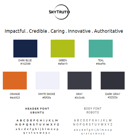
The brand look and feel dictates how you want your clients to see your business and the impression that you want to create. SkyTruth narrowed it down to five adjectives: impactful, credible, caring, innovative, and authoritative. This was the foundation for our font and color selection.
We wanted the tone for the new website to be one of credibility, trust, and expertise, but also cool and fun. SkyTruth is at the intersection of technology and conservation. It is about both technology and people. Tech can sometimes have a cold feeling so we wanted to also bring in the human aspect of their work and portray SkyTruth as a group of people who care.
Once we had the fonts and colors established we were able to turn it over to a graphic designer who created the logo and iconography for this project.

Audience
SkyTruth’s target audiences can roughly be categorized into three groups: Enablers (donors and capacity partners) Doers (environmental NGOs and academics) and Users (citizen scientists and activists).
We had to think about the specific journey each of the three different users must take to achieve the stated goals on the new site and how to serve specific users the right website content at the right time.
Sitemap
In order to establish the big picture for the website we created a sitemap.
When we were done we had a clear sense of the scope of the project, how many pages we were going to require, what navigation will be used, how certain aspects of the website can be grouped together, and how the website users will glide effortlessly through the customer journey.
We developed a new direction for SkyTruth's sitemap that put the user’s needs first.
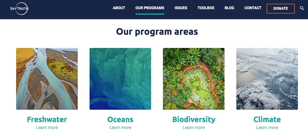
By clarifying the main navigation we created an experience that told the story of the organization while also making important information easy to access.
The site architecture was designed to make it easy for donors, academics, and scientists to get involved and participate in protecting our planet.

Navigation
The quantity of information offered on the SkyTruth website was a challenge when it came to addressing navigation.
Navigation connects the site visitor with the content so it was important to ask ourselves questions such as; Where are they on the site? Where do they need to go? How do they get back to where they were?
Captivating Images
We used carefully selected aspirational, satellite imagery throughout the site to capture the spirit of SkyTruth.


Impact Stories
A carousel with highlights of SkyTruth's impact stories was added to the Home page to showcase the depth and breadth of their work as well as build trust and credibility. These snippets link to case studies, the expanded version of the story, which helps bring SkyTruth's amazing work to life and demonstrate their work.
Dynamic News
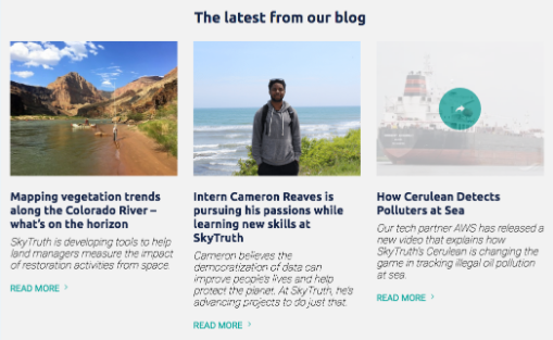
The website automatically pulls the most recent stories to display in this homepage section. These News posts help keep the homepage fresh while showcasing examples of SkyTruth's work.
Blog posts are also pulled into each of the eight Issues pages dynamically by category.

Newsletter Signups
Multiple engaging newsletter sign-up forms encourages users to stay engaged and keep in touch via email newsletters.
FAQ Page
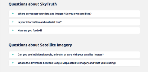
Users with questions generally have to browse through a few pages looking for the right answer, which can be annoying for a visitor that just wants a quick answer to an easy question.
As a solution, the creation of an FAQ page and compiled answers to common questions on every possible topic related to SkyTruth was undertaken, giving visitors a central place to find the answers they need.
By providing a single place to get answers to commonly asked questions, SkyTruth also benefits. Their website visitors now have a place to go when they otherwise might have picked up the phone to call, emailed, or left the site entirely.

Call To Action (CTA)
On pages that did not include a newsletter signup, we encouraged user engagement with a section in the footer that included buttons to donate and get involved.
Testimonials
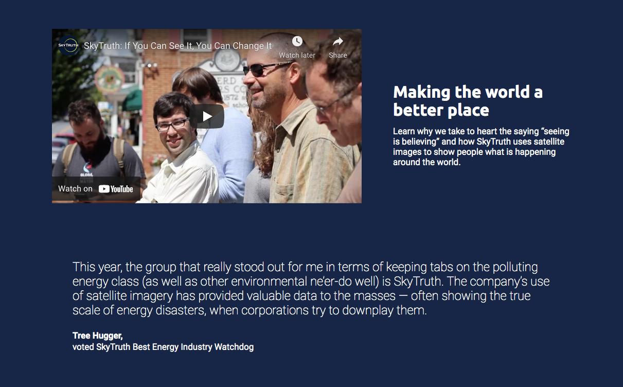
Nothing communicates SkyTruth's mission and its positive impact better than testimonials which we weaved throughout the site.
